Visuals are a big and important part of branding, and while many little pieces make up that brand identity, the first and most important thing is the logo. The logo is the entryway into your brand. It’s meant to be something people will know and recognize as soon as they see it.

photo credit: Lalesh Aldarwish / Pexels
When a brand has an iconic logo, it’s carries through in everything they do, from the packaging, and the website to the social media, and how people feel about interacting with it. That’s why coming up with a logo is an important part of brand design, and something that has to be taken seriously. So what makes a good logo from a graphic design perspective? Here are some insights and real world examples.
Has to Be Printable
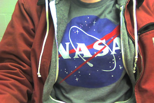
A logo has to look so good that it’s good enough to put on a t-shirt. Right now, we’re seeing a ton of clothing items emblazoned with logos of everything from NASA to defunct companies like Blockbuster. NASA’s logo has come back into the public consciousness in a big way. That’s because it’s instantly recognizable and people resonate with it, so it’s natural for people to want to wear it. It’s also important to note that it looks good too, and that’s driving its popularity.

photo credit: heart-felt-robot / Flickr
When you design a logo, think about how it would look on a something on a bigger format like a t-shirt. It’s really easy to print your own t-shirts these days. All you need is a printer, some sublimation supplies like ink, which you can get from online retailers like Crafting Besties. If it’s so simple to get a branded t-shirt, why not make sure that brand looks good?
It Has to Be Authentic to the Brand
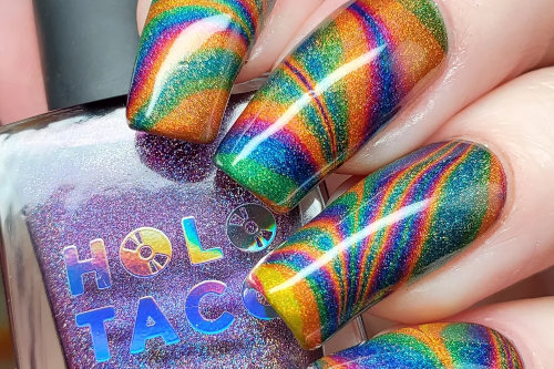
You would be forgiven not knowing YouTuber, Cristine Rotenberg, also known as Simply Nailogical but she’s one of the most successful creators on the planet with millions of subscribers. As her name suggests, her content is focused on nail polish and two years ago she launched her own brand called Holo Taco.

photo credit: r/RedditLaqueristas / Reddit
The branding of the company is genius, well-thought-out and of course, incredibly authentic and familiar to her fans. People who watch her content know that she loves holographic glitter nail polish, and that she calls holographic top coat “taco”, hence the name of the brand. It’s a clever naming that reflects the identity very eloquently.
Her logo also reflects this. It is a taco shell and a CD. It perfectly encapsulates the name of the company, and it’s also extremely social media friendly, as people can use a taco and CD emoji for the brand. It’s a very simple logo design but a very effective one because it delivers the message incredibly well, and also showcases Rotenberg’s unique sense of humor.
Be Clever
When pulled off the right way, a logo can be really smart. Think about how Beats by Dre’s logo is an initial at first glance, but how it’s actually an icon of a person wearing the headphones listening to music. This is a really clever way to make the logo actually tell the story of what the product is, while also being very simple.

photo credit: Ajay Suresh / Flickr
The takeaway from this: Don’t be afraid to put some personality, and to give a logo that’s in its own way an Easter egg that your fans can theorize over, and get excited about when they figure it out.
Try Simplicity
Logos don’t have to be elaborate to be effective, and with the right graphic that doesn’t have to be boring either. You can use the simplicity to play into your product’s story or your company’s values. Take skincare brand The Ordinary, for example. Their whole point of view is bringing high-quality products that are focused on special formulations and ingredients that sound more like they belong in the lab.

photo credit: Maya Guy / Pinterest
What makes them special is that they develop these dermalogical-level products at a very affordable price. Their logo is just their name, done in a very simple font, and it’s very effective because it shows that what matters to them isn’t an elaborate or overcomplicated logo, but that it’s all about what’s in the bottle.
Branding matters, it’s an important aspect of creating an identity that people want to be a part of. Your logo represents the top of the “funnel” into your world, and the better your logo is, the stronger than initial connection will be. The goal is for people to look at your logo, get a glimpse into your brand, and get a strong understand of what you sell, and most importantly what sets you apart from your competitors.
Your logo should be unique and really differentiate you. Brands arrive at a great logo differently, but ultimately it’s about being strategic, authentic, smart and not trying too hard. A good logo is an asset – so developing it should be given a lot of thought.


