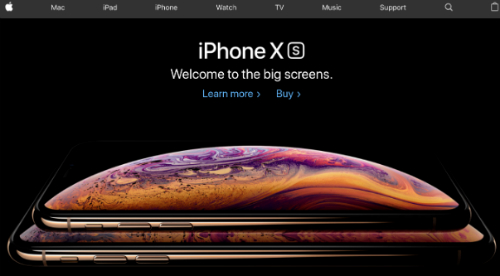
To make a trending website you have to keep on updating it. And for that, you have to focus on the part that hooks your users; the design. A new design can make your website a leading giant in its field. Sticking with the “same old, same old” because it works is like being the kid in school who wears the same clothes every day — they’re never popular for the reason most of us would like to be, right?

Whether you’re using professional tools or free website builders, hiring a web designer or DIY, you need to know what works and what doesn’t. To get you started, here are the 7 trending website elements you must know to create your dream website.
1. Simplify the Menu
After landing on the website all users first scroll the menu. Pay attention to it. Build a sprawling menu or a hamburger layout (lines stacked one over the other.) This will add to the ease of use and share-ability rate of your site and help it grow.
2. Cut the Clutter
If your aim is to get traffic on your website, then you have to remove the clutter on your website layout and interface. Simplicity is the key.
Clean your website up, and only add required buttons and forms. Plan your design well. Add a subscription form and links for e-books where visitors would be most likely to see. Use pop-ups, but do so sparingly.
3. Being User-friendly is the Secret
It’s the user who decides whether your site is useful, informative, entertaining, etc. If you’re in the good books of your visitors, search engine ratings will naturally spike. A top notch UX design is essential. Look around and note elements on other websites that make your experience easier. Produce top-level content and a user-friendly website. Users never return to a confusing website even if it shows up high in the search engines.
4. Let Pictures Talk to Users
To hit your website on the trending list, start using crisp and informative illustrations. Pick large images and let them help spread your message. Visuals are easy to read and hard to forget. So, you can expect your visitors returning because of a new illustration on the website homepage.
5. Fonts do Matter
The success ‘Apple’ is because they pay meticulous attention to detail. Steve Jobs wanted everything to be perfect. Be it user interface, touch, design, and even fonts. Use large, easily read, bold fonts. Mix up the sizes and designs. Fonts are very important!

6. Do not Design a Rainbow
A rainbow looks good in the sky, but not on your website. Colors can make or break you. Study how Google.com is designed. It doesn’t have each letter in different colors, but rather just four color in total at any given time. Do what’s proven to be successful and choose color elements well.
7. Reach the Masses with Video
Pictures can boost your website but videos can make it super user-friendly. Use vibrant and short background videos showing what you offer to users. Wake the kid in you because animated videos can do the trick. A little effort on videos will save your user time, allowing you to reach a wider audience.
At last, ensure that your customers are given the center stage. Creating value over the desire to be too fancy is a real game-changer when it comes to creating a viral site and viral content. Focus on minimalist designs but turn up the volume in terms of offering value. The value offered is your brand, not fancy colors, cluttered menus, and lack of personality.


